

IN Store
Art Direction, Visual Identity & Strategy
Campaign, Packaging
2022
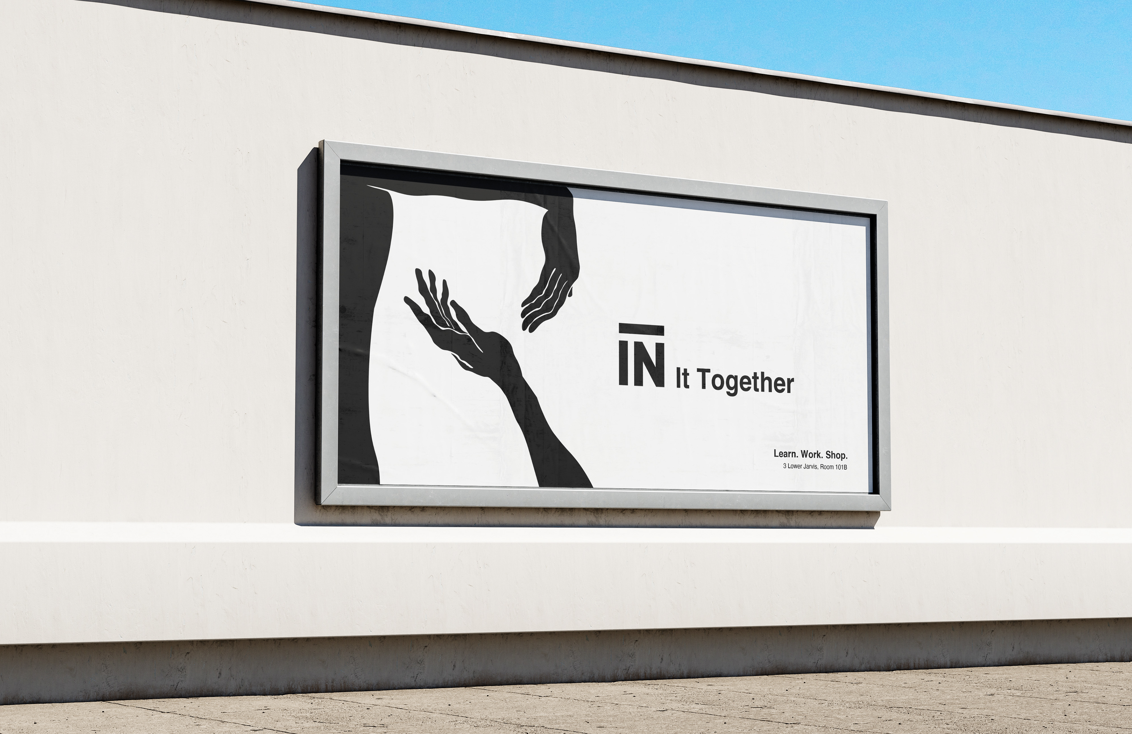
The IN Store is a hub where ideas flourish, fostering a spirit of play, discovery, and intervention. Rooted in student success, inclusivity, and collaboration, it's a space where the IN community, including students, alumni, faculty, and the design community, come together. The concept, IN It Together, symbolizes the collaborative effort behind the IN Store.
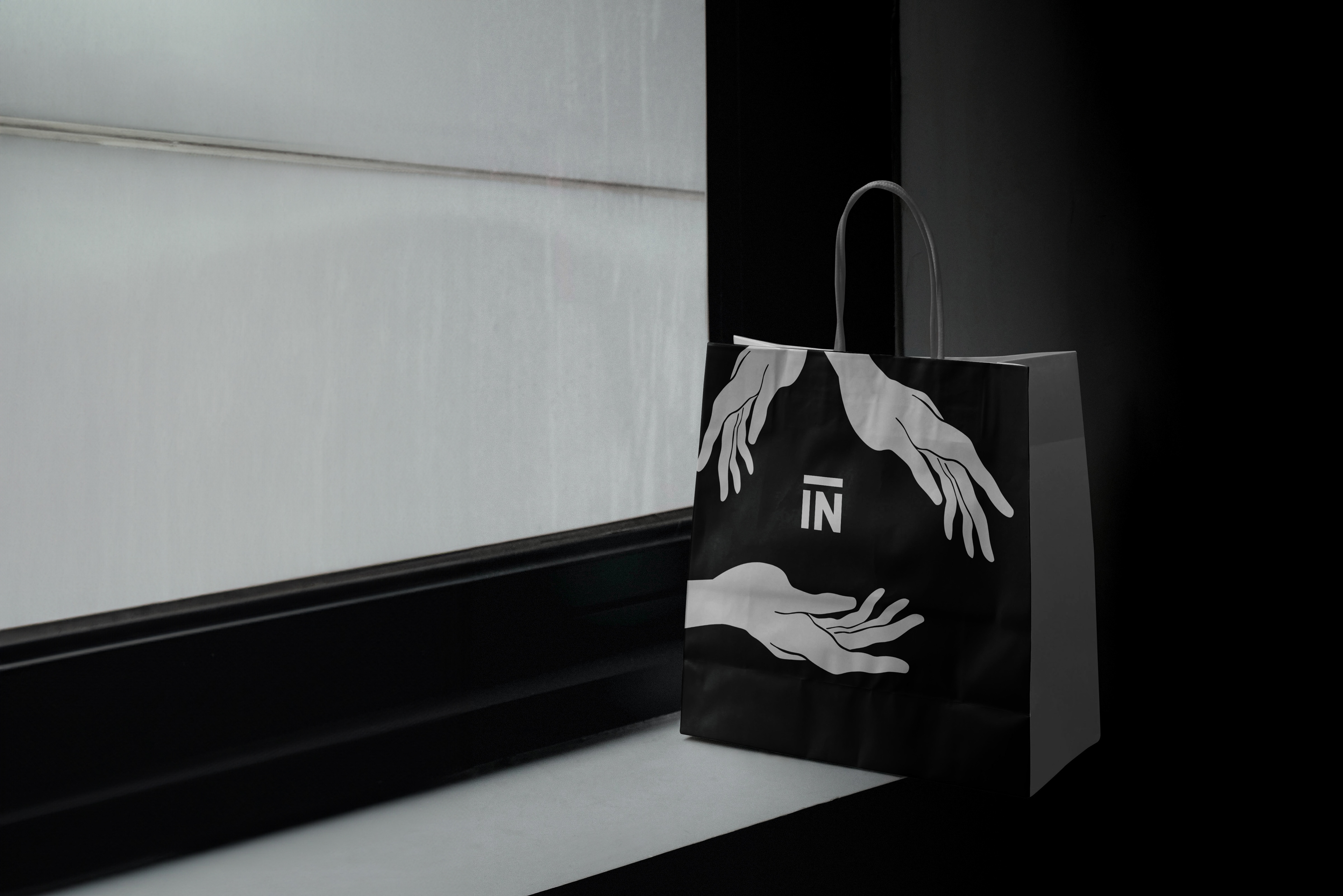
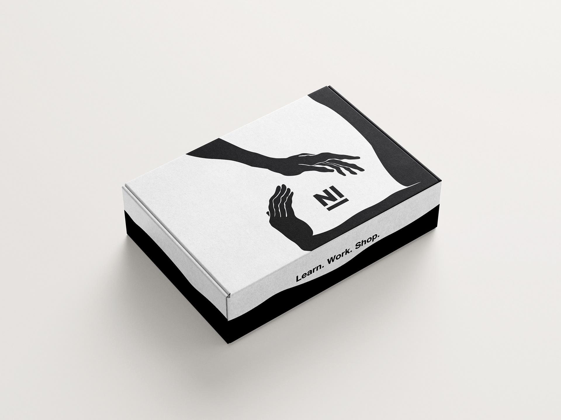
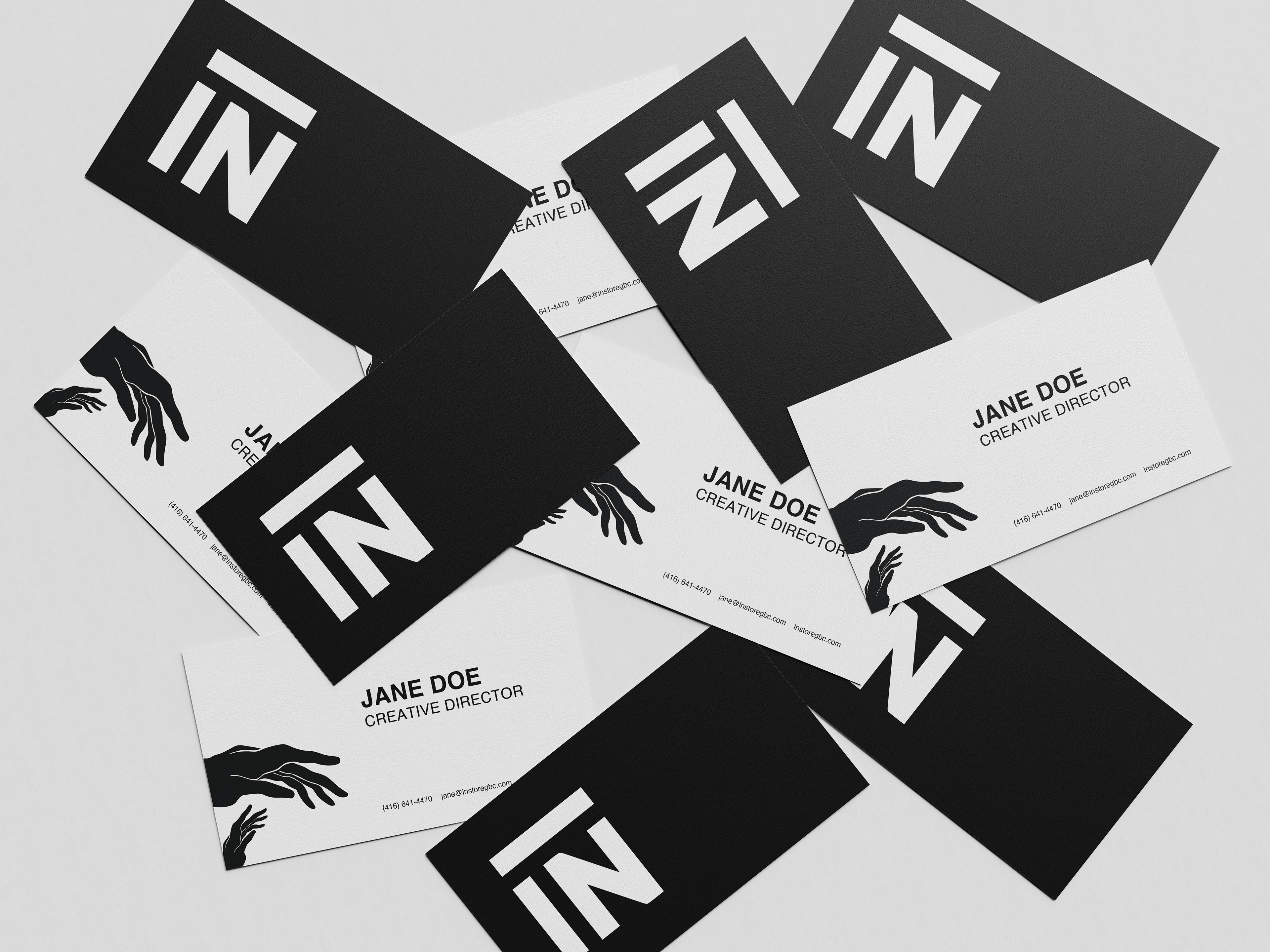
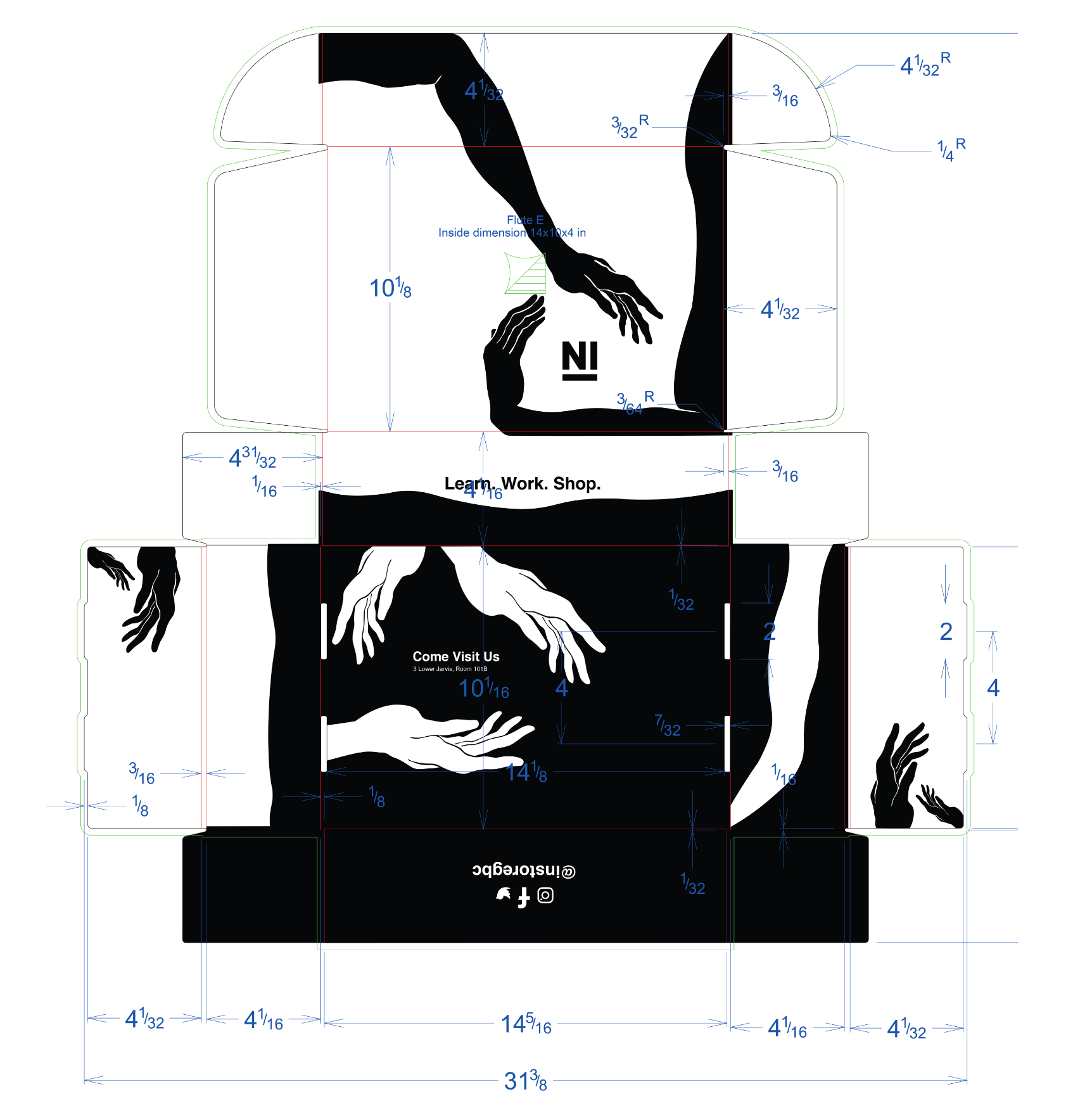
The concept showcases hands, embodying the unity of students and faculty shaping a successful studio and store. Placing the IN logo at the centre emphasizes its significance. Strategic use of negative space and adherence to the brand style guide create a cohesive and impactful visual.
The length of the hands spanning the mediums signify the experiential growth students gain at IN. The fluid and abstract illustration mirrors the limitless possibilities for personal and professional development within the studio. Symbolizing community engagement or students extending support. Any additional hands featured, symbolize inspiration or the unseen contributors behind the scenes.
Overall, this concept invites the target audience, GBC students and local community members, into the IN community, creating a sense of belonging and celebrating collaboration and inclusivity.